Every rebuild has a moment where you decide what you're willing to bet the whole thing on. For this one, I bet the homepage on two shades of green.
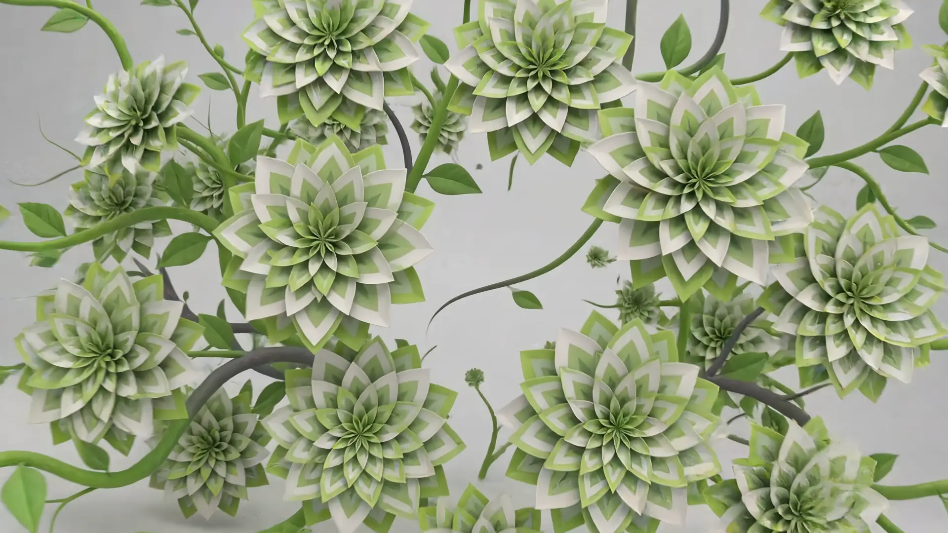
The new site opens on a ten-second film, rendered in 4K. The OutGrowth logo sprouts vines, and the vines bloom into dahlias. Not real dahlias. Paper ones, modeled in 3D by hand, with the folds and the slightly-too-crisp edges that paper actually has. The film ends by pushing into the bloom until the frame is nothing but a solid field of green. That's where the bet lives: the page section that follows is painted the exact same green. If the two match, film and page fuse into one continuous surface, and you can't tell where the cinema stops and the website begins. If they're off by a hair, the illusion dies at the seam.
Two greens, measured the hard way
So I measured. Pixel by pixel, against the final frames. The opening film lands on #618e42. The second film, which I'll get to, lands on #8bbe3f. Two different greens for two different handoffs, each one checked against the section it dissolves into. It's the least glamorous work on the entire site and the reason everything above it holds. Nobody will ever notice it, which is exactly the point. The best seams are the ones you can't compliment.
The film you play backwards
The opening film plays itself. The second one, you play.
Further down the page there's a sequence wired to your scroll. I extracted 48 frames from a second film and rigged them with GSAP ScrollTrigger so that scrolling scrubs through them in reverse. You pull back through the vines to a full wall of paper flowers, hang there a beat, then dive back into green. Scroll up and it un-happens. No play button, no timeline. Your thumb is the projector.
I like the backwards structure more than I expected to. A film that plays at you is a pitch. A film you can scrub in either direction is a place you're standing in, and you decide how long to stay.
Why paper
The honest answer: stock is a shrug. The archive behind this site holds 206 projects, including 90 for Hustler Magazine, 43 for Business Review Canada, and 29 for The Reverse Review, and twenty years of making things has left me with one conviction worth engraving. The asset anyone can license is the asset no one remembers.
Paper flowers are slow. You model every curl and crease, and most of that effort lands in frames a visitor sees for a fraction of a second. But somewhere in that fraction, something registers: someone made this. That flicker is the entire pitch of a studio like mine. Everything on our services page, from photography and retouching to editorial and publishing, is a species of the same act: making the thing instead of finding it. The homepage had to be that same act, performed in public.
No build step, on purpose
Under the hood, the site is vanilla HTML, CSS, and JavaScript. One animation library, GSAP, for the ScrollTrigger scrubbing. No framework, no bundler, no build pipeline. When it was finished, I deployed it by hand.
I know how that sounds in 2026. Here's how it feels: I can open any file on this site and read exactly what it does. If something breaks the night before a launch, there is no layer between me and the fix. Tools should be legible to the hands that use them, and a portfolio site that needs a compile step to change a comma is telling on itself.
The type follows the same logic. Fraunces carries the headlines, a serif with warmth and a little intentional wonk, and Archivo does the working text, plainspoken and sturdy. One voice for saying things, one hand for writing them down.
Sage, instead of a form
The contact page has no form to shout into. It has Sage, a discovery AI that asks the questions I'd ask at the top of a first call: what you're making, who it's for, what done looks like. Then it turns your answers into a real brief. Not a message in a queue. A document we can actually start from. It's the difference between "we'll get back to you" and a conversation that's already underway.
The Greenhouse
The whole concept has a name in my notes: The Greenhouse. Our line has always been "your passion is our business," and I wanted the site itself to demonstrate what that means rather than repeat it. I ration myself to one growing metaphor per piece, so here it is, spent deliberately:
A greenhouse isn't decoration. It's a working building of glass, heat, and daily attention, put up so that something that isn't yours can thrive. Your passion is the plant. We're the structure and the weather.
For the notebook margin, the specs:
- One ten-second 4K opening film; a second film scrubbed backwards through 48 extracted frames.
- Two greens, #618e42 and #8bbe3f, matched to their page sections pixel by pixel.
- Vanilla HTML, CSS, and JavaScript with GSAP ScrollTrigger. No build step. Deployed by hand.
- Fraunces and Archivo.
- Sage at the door, ready to take a brief.
That's the story of the relaunch: dahlias folded out of paper and math, a homepage that bets everything on a seam holding, and a studio showing you its work the only way I trust, which is doing it in front of you. Go scroll it backwards and check the seams.