Logo & Branding
Logo & Branding
01 · The Seed
Absolute Bag arrived with one of those names you don't get every day, vivid and a little odd and impossible to forget, and with a social media marketing business that needed everything else: a logo, letterhead, business cards, the works. My job was to give the name a face, then make sure that face held up on every piece of paper the company would ever hand someone.
02 · The Groundwork
The name handed me a gift: an A and a b that wanted to touch. I sketched toward a monogram where the two letterforms share a stroke. Two letters, one continuous line, the whole brand in a single glance. Around it, a palette with actual personality: deep teal against dark chocolate, a shot of magenta for the descriptor. Friendly enough for a feed, grounded enough for a boardroom.
03 · The Growth
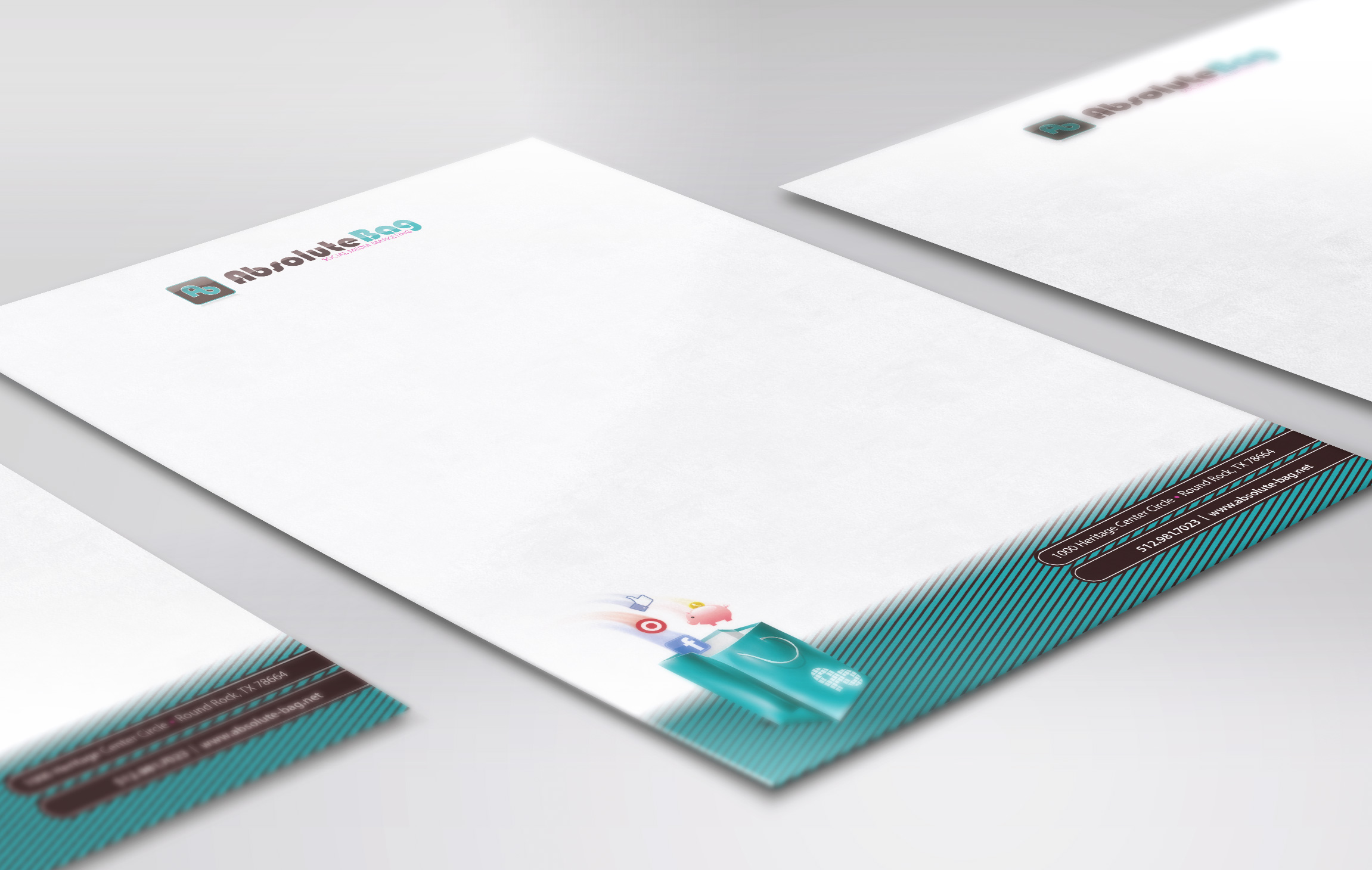
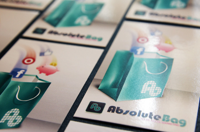
The finished mark sets the teal Ab ligature on a glossy chocolate-brown tile with rounded corners, deliberately shaped like an app icon, because that's the world this client lives in. In the full lockup, "Absolute" runs in espresso brown, "Bag" in teal, with SOCIAL MEDIA MARKETING sitting underneath in magenta.
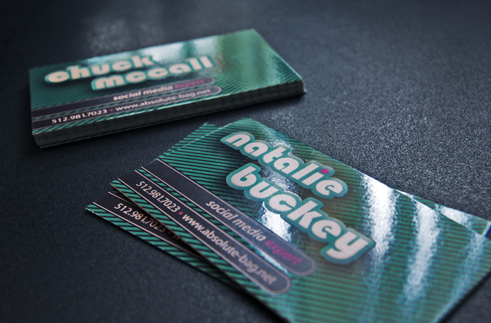
Then the system spreads. A diagonal teal pinstripe wraps the letterhead's lower corner in a band carrying the contact details, while a small illustration of social icons and a piggy bank tumbling into a teal shopping bag makes the name literal at the foot of the page. The business cards run that pinstripe edge to edge on high-gloss stock, in both vertical and horizontal layouts, with each team member titled "social media expert" in the same rounded letterforms as the wordmark.
“Two letters, one continuous line: the whole brand in a single glance.”
04 · The Bloom
Absolute Bag walked away with a complete identity: a monogram that works at avatar size, a wordmark that works at arm's length, and stationery that ties the two together. Twenty years in, I still believe a brand takes root fastest when every piece, from card to letterhead to icon, grows from the same mark.