The Reverse Review
The Reverse Review
01 · The Seed
The Reverse Review is a monthly trade magazine serving reverse mortgage professionals, and like every publication it lives on ad pages. Media kits in financial publishing tend to be rate cards with a staple through them: data first, dignity optional. The magazine needed its 2010 kit: something to hand advertisers that would carry the circulation numbers, the editorial calendar, and the ad specs without reading like an accounting document. It's one of 28 projects I've built for this client.
02 · The Groundwork
My position was simple: a media kit should sell the magazine the way the magazine sells itself. So instead of decorating a spreadsheet, I built the kit as an editorial object, with original black-and-white photography, one idea per spread, each anchored by a single word and its dictionary definition. The business information sits on facing pages, cleanly set, so an advertiser gets the romance and the math in the same glance.
03 · The Growth
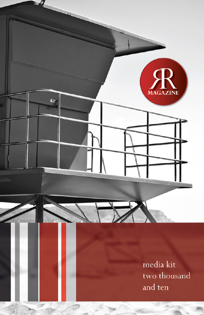
The cover sets the terms: a lifeguard tower photographed in black and white against an empty sky, the RR monogram seal in deep red, and "media kit two thousand and ten" spelled out in a quiet lowercase serif. A striped band of reds, grays, and blacks runs through the whole kit as connective tissue.
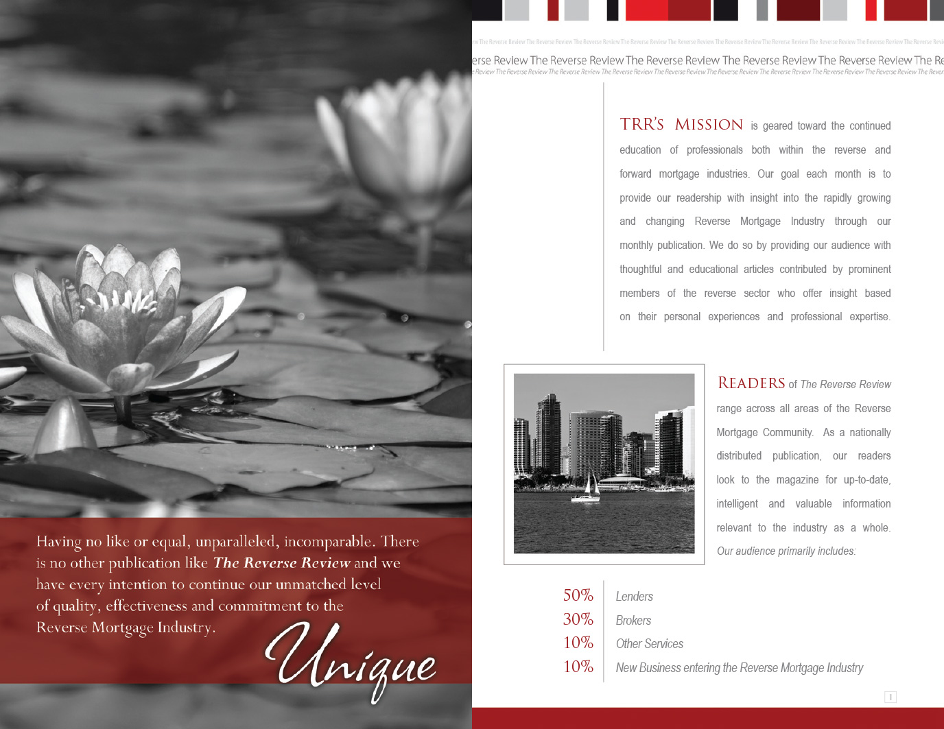
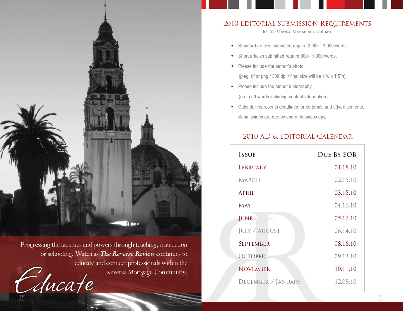
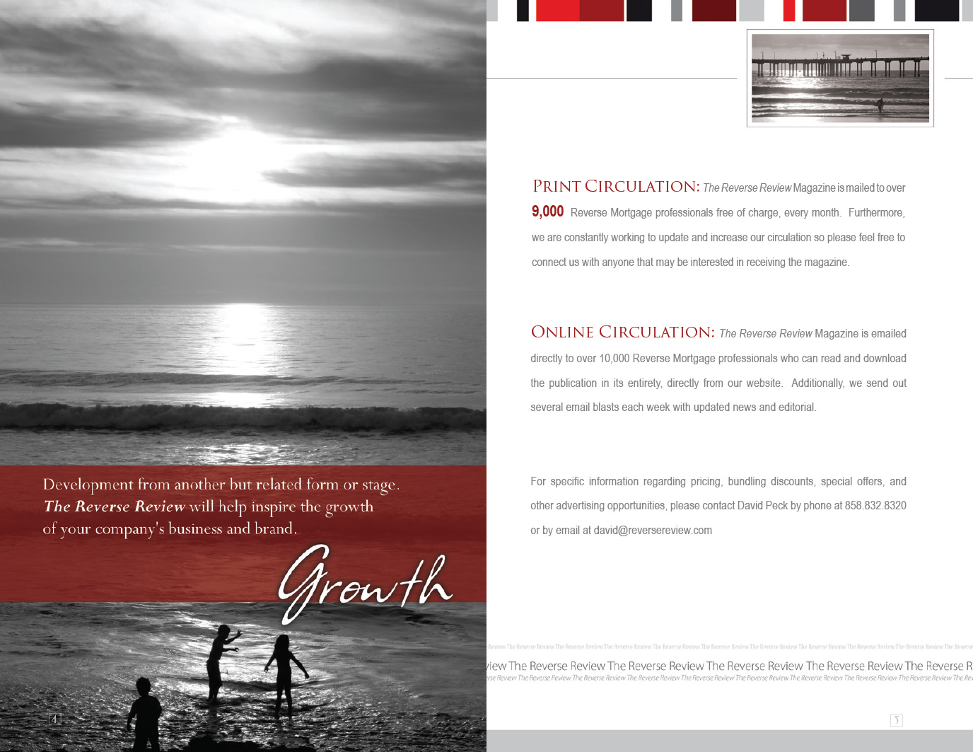
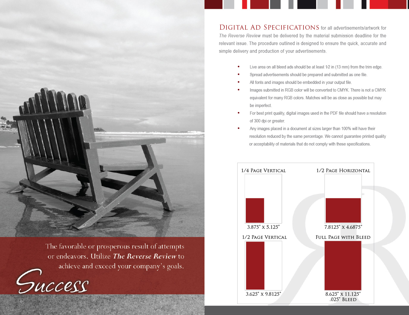
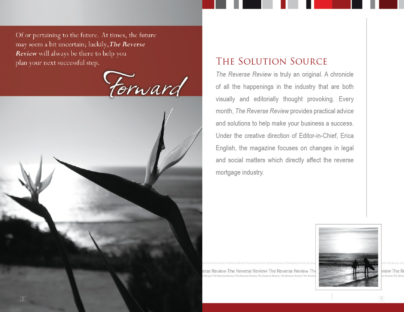
Inside, every spread pairs a full-bleed photograph (water lilies, the California Tower in Balboa Park, children silhouetted in the surf, an empty wooden chair on wet sand) with a single word in white script on a red band: Unique, Educate, Growth, Success. (Yes, one spread is literally titled Growth. I run a studio called OutGrowth. I didn't argue.) Facing pages hold the working parts: readership breakdown, editorial calendar, circulation figures, and ad-size diagrams drawn in that same red, so even the specs feel designed.
“A media kit should sell the magazine the way the magazine sells itself.”
04 · The Bloom
The finished kit hands the sales team an argument they never have to make out loud: if the magazine puts this much care into its own rate card, imagine what it does with your ad. Photography, branding, and layout all pointed the same direction, toward a business document an advertiser might actually keep on the desk.