Business Review Canada
Business Review Canada
01 · The Seed
Business Review Canada came to me with its E3 coverage: a writer's dispatch from the video game industry's annual trade show and a pile of press assets to sort through. The brief was photo selection and layout design, which meant taking a business magazine onto the loudest show floor in tech and making the pages hold their own against the subject matter.
02 · The Groundwork
A business magazine covering a game expo can go two ways: dress the story down until it reads like a quarterly filing, or let the games set the tone while the magazine keeps its spine. I chose the second. Fixed running headers, folios, and footers hold every page to the publication; inside that frame, each spread hands its palette and imagery over to whichever console or title it covers.
03 · The Growth
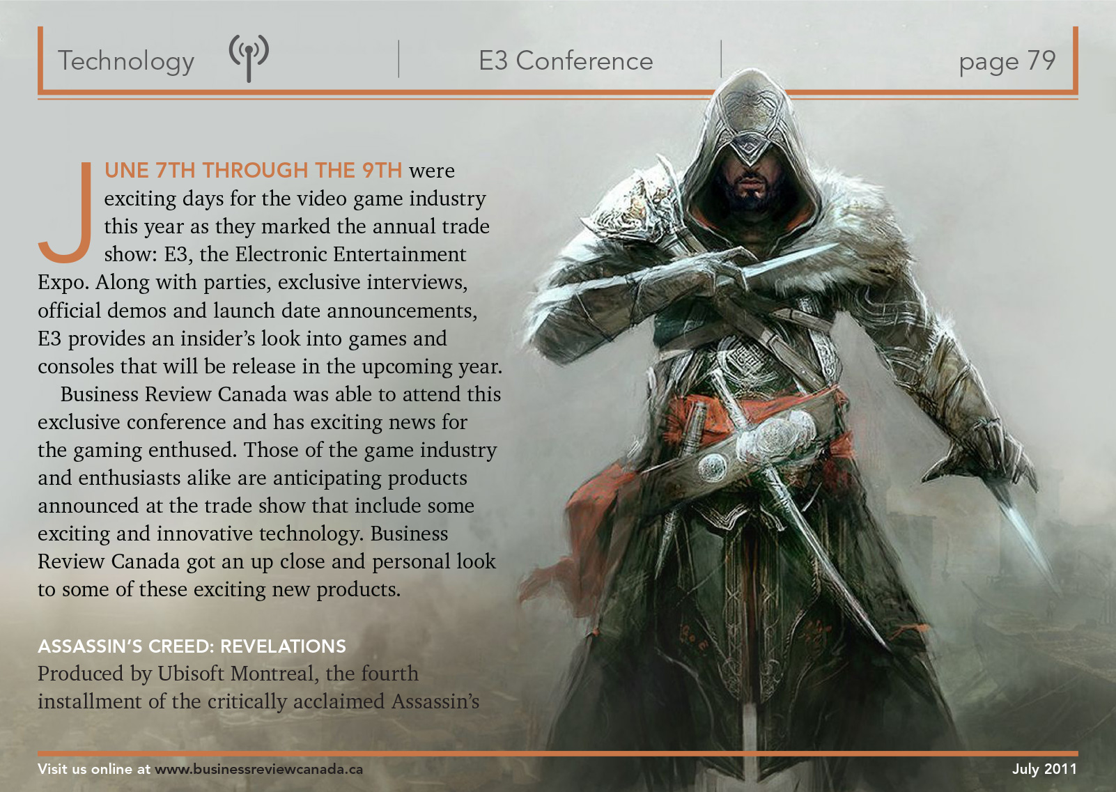
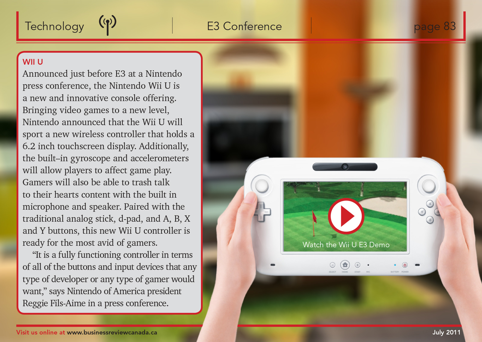
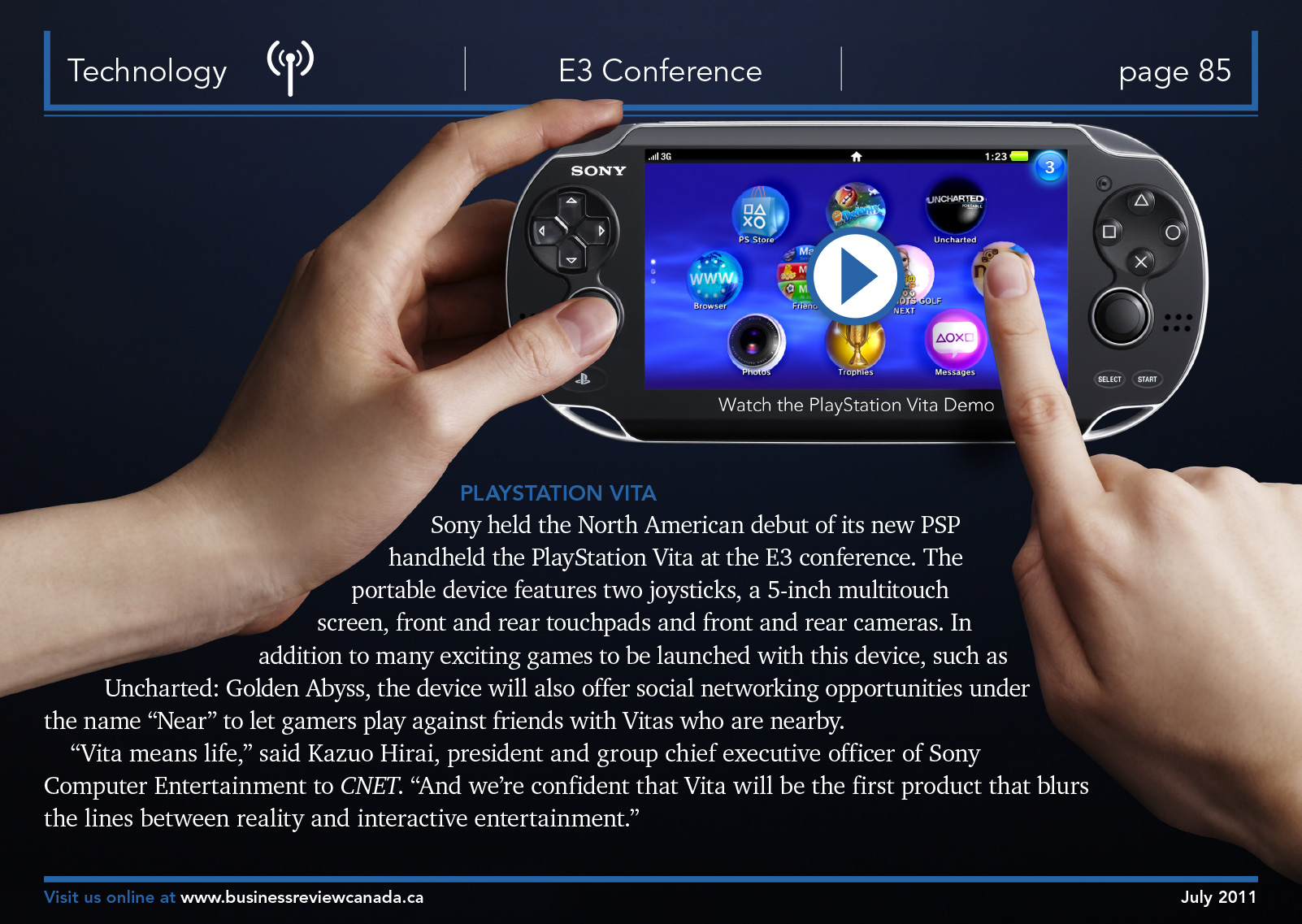
The opener sets a chrome E3 logotype under a spotlight, particles drifting down through the beam: a stage the moment before the reveal. From there, every spread borrows its palette from the game it covers. The Assassin's Creed page runs full-bleed concept art beside serif body copy, a tall drop cap, and orange rules that echo the artwork. The Wii U and PlayStation Vita pages build around hands-on product photography, with body text contour-wrapped along a forearm on the Vita spread.
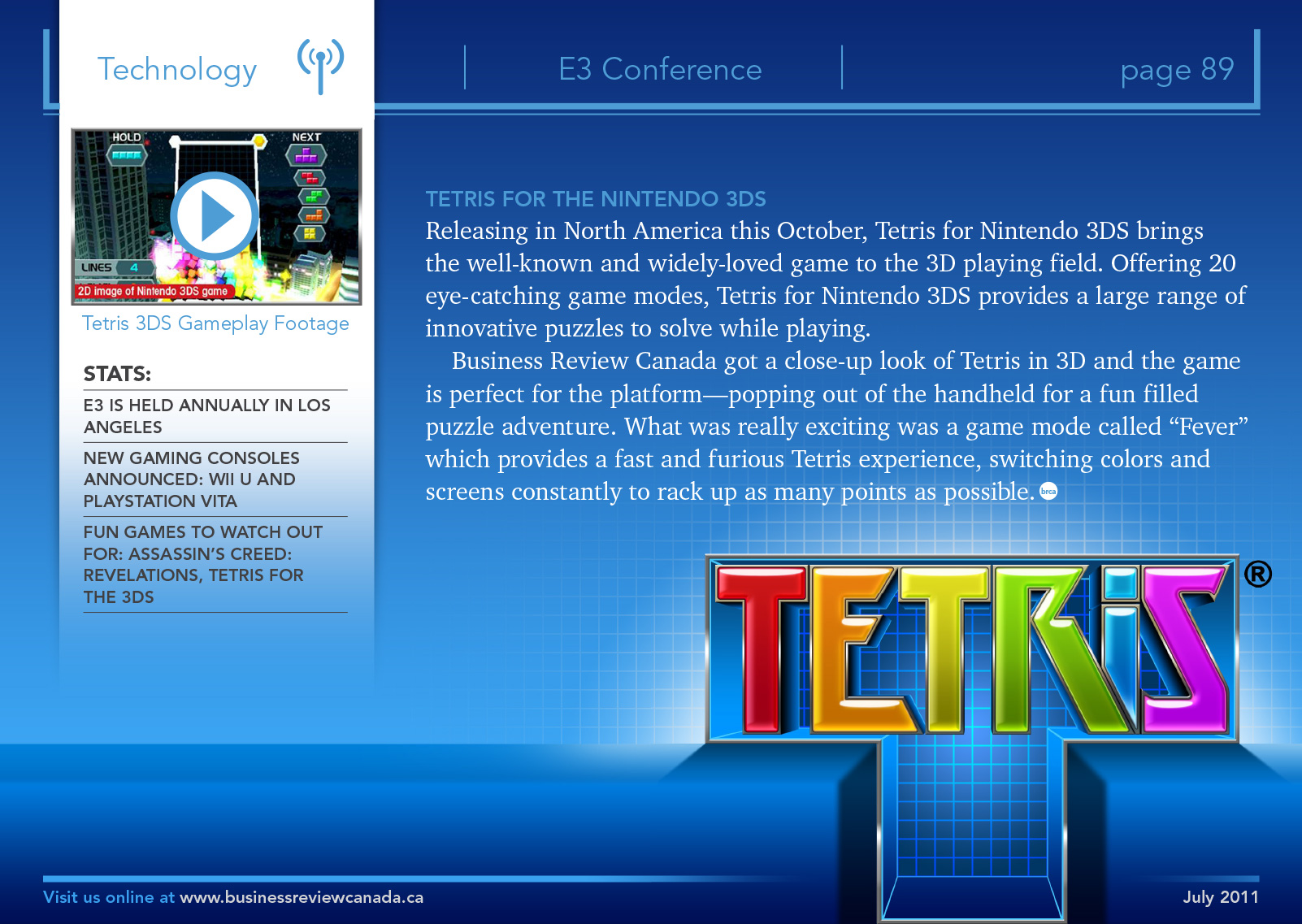
Because this was a digital edition, the hardware pages carry embedded play buttons, so readers could watch the Wii U and Vita demos without leaving the layout. The Tetris closer trades all that dark for bright grid blues, with a stats sidebar for the skimmers.
“Every spread borrows its palette from the game it covers.”
04 · The Bloom
The finished feature is a technology story that behaves like a magazine and reads like the show floor: consistent enough to trust, varied enough to keep a reader tapping through. It sits in a body of 43 projects I've produced for Business Review Canada, and it's still one of the quickest tours of E3 you can take sitting down.