The Reverse Review
The Reverse Review
01 · The Seed
The Reverse Review, a trade magazine serving the reverse mortgage industry, runs on advertising. Ad space doesn't sell itself. The team had a calendar full of monthly specials to promote: discounted contracts, advertorial packages, a free business-directory listing. What they didn't have was a way to put those offers in front of busy industry prospects without looking like every other B2B blast headed for the trash folder.
02 · The Groundwork
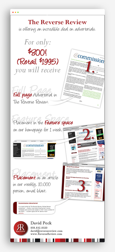
One idea per email: that was the whole strategy. Rather than pour new copy into the same tired template each month, I built a brand frame the magazine could own: its barcode-style stripe of reds, blacks and grays, a deep crimson accent, classic serif type. Then I let a single visual metaphor carry each send. The result reads unmistakably as The Reverse Review, while every email looks designed for that offer alone. Because it was.
03 · The Growth
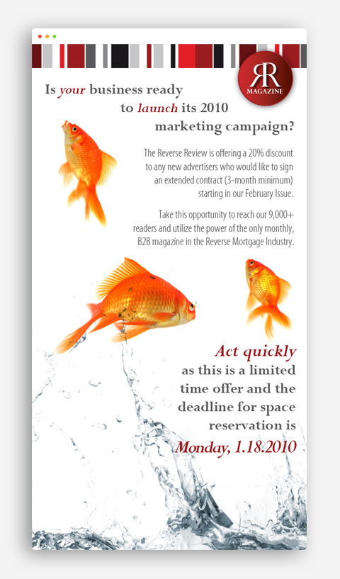
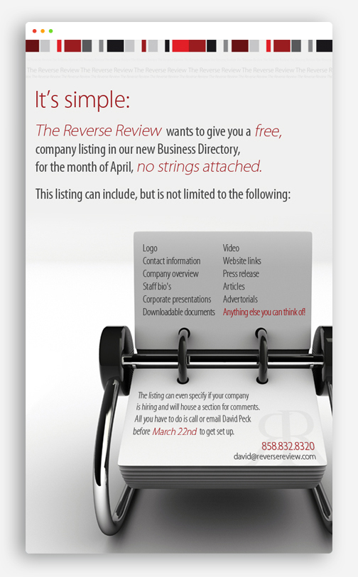
The gallery shows how far a single idea can stretch. An empty parking space stenciled "reserved for your campaign" sells discounted ad contracts. Red darts hit a bullseye for a free ad-design offer. Goldfish leap from splashing water to launch the new year's push. A photorealistic Rolodex pitches the business directory, and a grid of four black-and-white photographs (recruiting, technology, services, lead generation) orbits one red circle that simply reads "branding."
Underneath the concepts, the system holds steady: generous white space, serif headlines in crimson and gray, the magazine's barcode-style brand stripe running along the top or bottom, and a red bar that hands you the phone number. Every send got its own metaphor; every metaphor made the same ask.
“Every send got its own metaphor; every metaphor made the same ask.”
04 · The Bloom
The Reverse Review walked away with a family of seven email layouts to rotate through its promotional calendar: each one on-brand, none of them interchangeable. This campaign is one branch of a 28-project body of work for the magazine, which tells you what the emails themselves can't: the client kept coming back.