Logo & Branding
Logo & Branding
01 · The Seed
Print Frenzy is a Texas print shop that needed the full starter kit: a logo, a business card, and a sales sheet their team could actually write orders on. Three pieces, one identity, and every bit of it destined to run through their own presses, which is a nice built-in quality check. If the brand couldn't survive the shop floor, it didn't belong on the sign.
02 · The Groundwork
My strategy was simple: the best raw material for a printer's brand is printing itself. Registration stripes, process color bars, big honest type. The stuff moving through their shop every day could move through their identity too. I also wanted the system to work as hard as they do, so the sales sheet couldn't be an afterthought. It had to carry the brand straight into the paperwork where deals actually get signed.
03 · The Growth
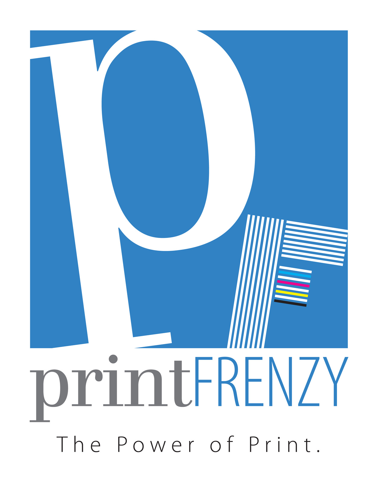
The mark leads with an oversized serif p, tilted and cropped like it was caught mid-press run, white against a field of process blue. The F beside it is built entirely from stripes, with a tiny CMYK color bar tucked inside: the four inks the whole trade runs on. The wordmark pairs quiet gray lowercase with tall blue capitals, and "The Power of Print." sits letter-spaced beneath.
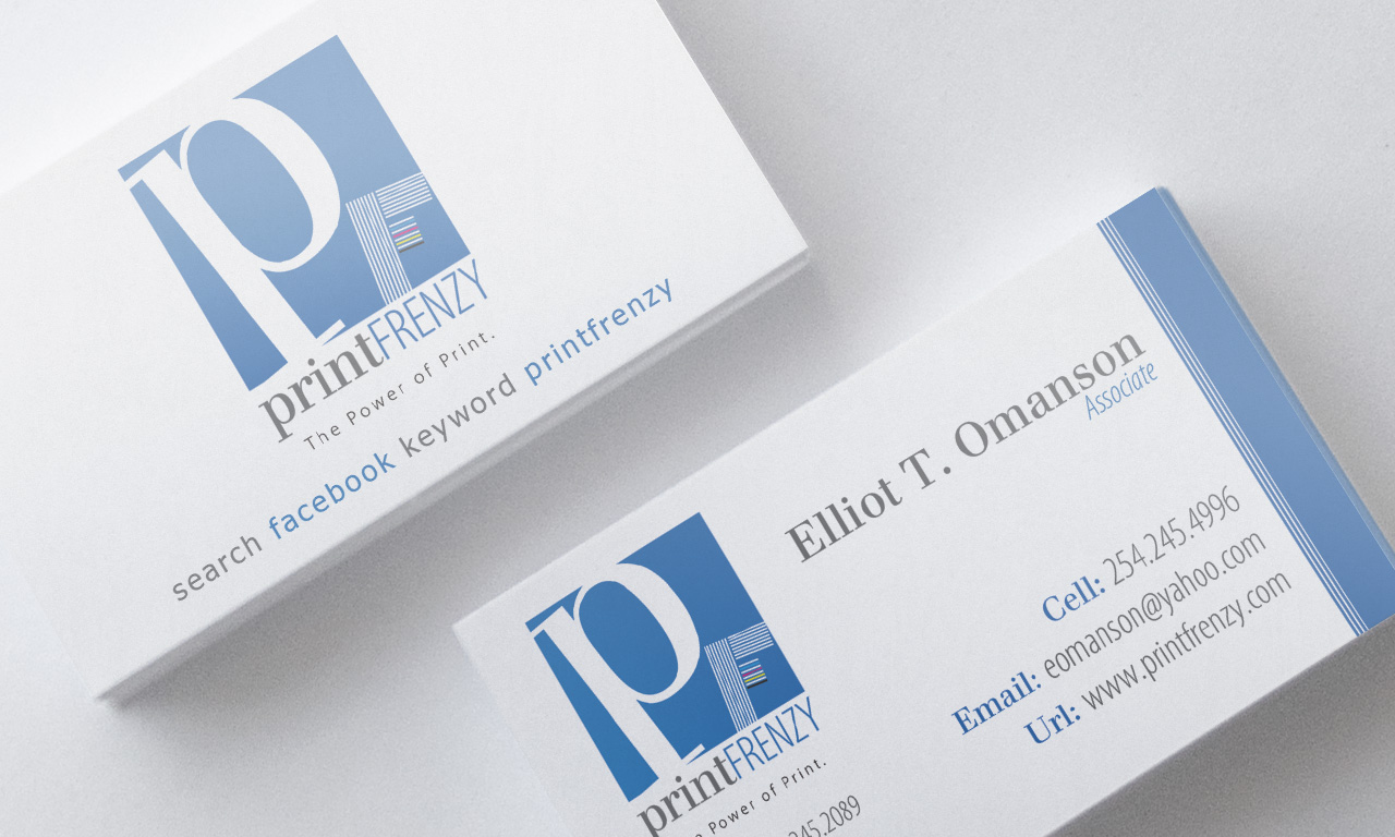
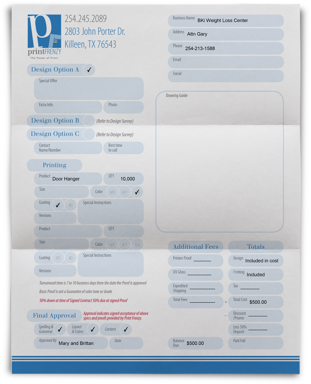
From there the system fans out. The business card carries the striped edge on its back and a plainspoken "search facebook keyword printfrenzy" on the front. The sales sheet turns working paperwork into brand real estate: design options, print specs, and approval checkboxes all set in the same blue, so even the order form looks designed.
“The best raw material for a printer's brand is printing itself.”
04 · The Bloom
Print Frenzy ended up with an identity that speaks fluent printer: one mark, one palette, three pieces that behave like a matched set from the front counter to the signed proof. When a brand is grown from what a client already does best, it holds together on its own. Theirs happens to be ink.